
Designing an AI Reading Companion for Cross-Cultural Literature
I didn't grow up reading in English; I learned it from textbooks and the GRE. Then I moved to the States and bounced off every magazine I subscribed to, not because the words were hard, but because the world behind them wasn't mine. Lumi is the AI reading companion I wish I'd had: it brings cultural context inside the book, so non-native readers stay immersed instead of peeling back a film between them and the page.
- design
- 0→1 web MVP, agentic interface
- my role
- sole product designer, ux researcher
- duration
- 11 weeks, 2025
An AI companion that keeps readers immersed
I didn't grow up reading in English. I learned it from textbooks and the GRE, then moved to the States in 2021 and assumed reading would be the easy part. It wasn't.
I subscribed to The New Yorker, The Atlantic, The Economist, and canceled every one. I could define every word on the page and still feel locked out of the world behind them.
Reading in my second language felt like a thin film between me and the page. I had to peel it back just to follow along.
Lumi is the AI reading companion I wish I'd had. It brings cultural context inside the book, right when you need it, so non-native readers never peel that film back alone. I designed the end-to-end MVP solo in 11 weeks; in testing, all four readers understood the value on sight.
Everyone stops at the words
Before sketching anything, I went looking for tools that already do this well. If staying immersed in culturally dense writing was a solved problem, I wanted to know who had solved it.
Direct reading apps all nail the same promise, a clean and distraction-free place to read, but the experience stops at the words on the page.
Adjacent platforms like Blinkist, Readwise, and The Pudding treat depth as the product. Lumi is built on the same idea, except the depth lives inside the story instead of outside it.

Where immersion breaks
Going in, I wasn't sure what Lumi should be: an e-reader, a curated library of non-Western books, or something in between. Rather than commit to a form too early, I let the interviews decide it. I focused on readers of culturally rich literature, mostly Asian to start, and looked for where reading actually broke down.
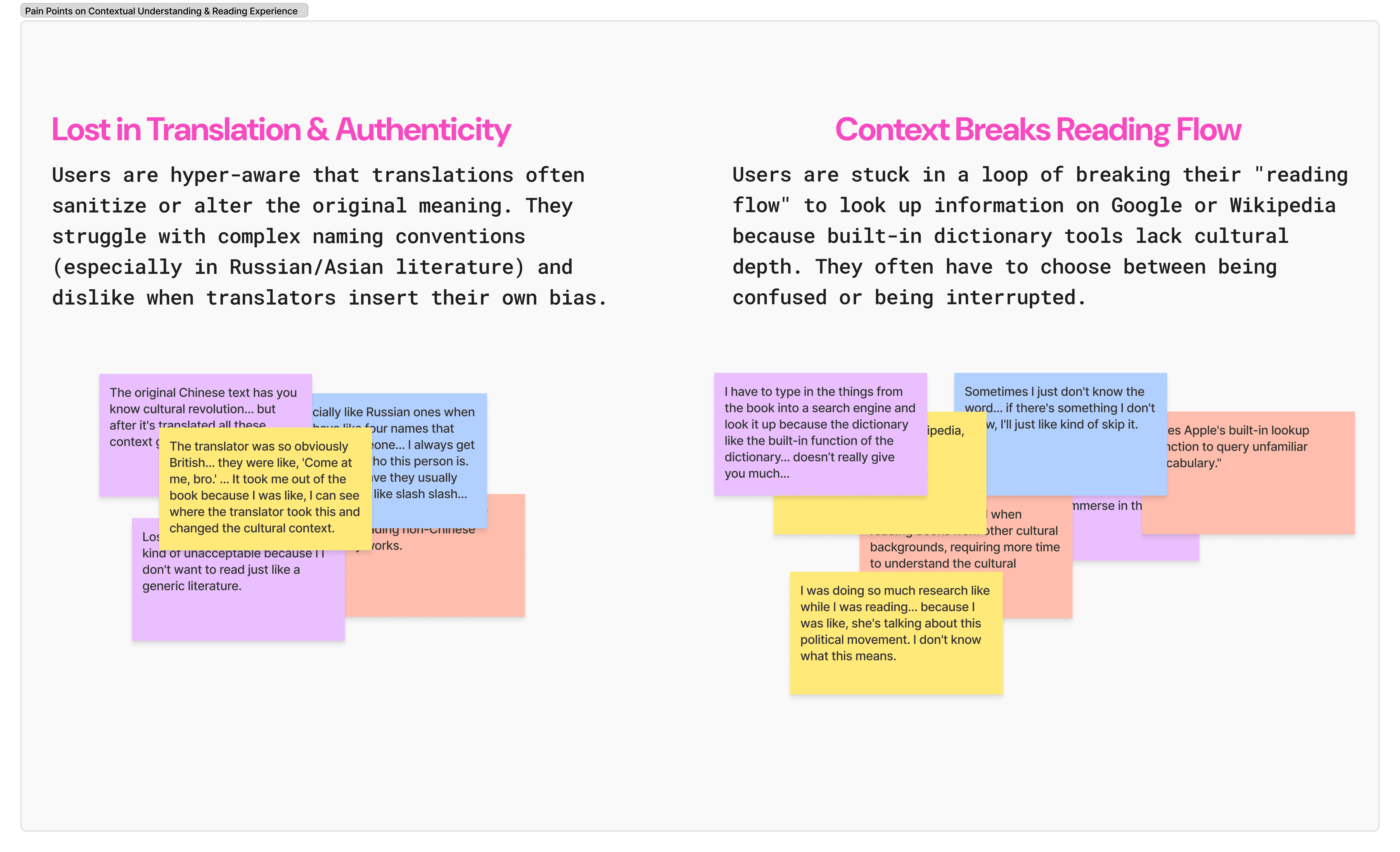
Context gaps break the read
Translations sanitize original meaning and insert translator bias, and cultural nuance from the source often disappears. Every participant reported stopping mid-read to Google a cultural concept, historical event, or geography. The core problem: existing tools define words, not cultural meaning.
Readers can't picture the world
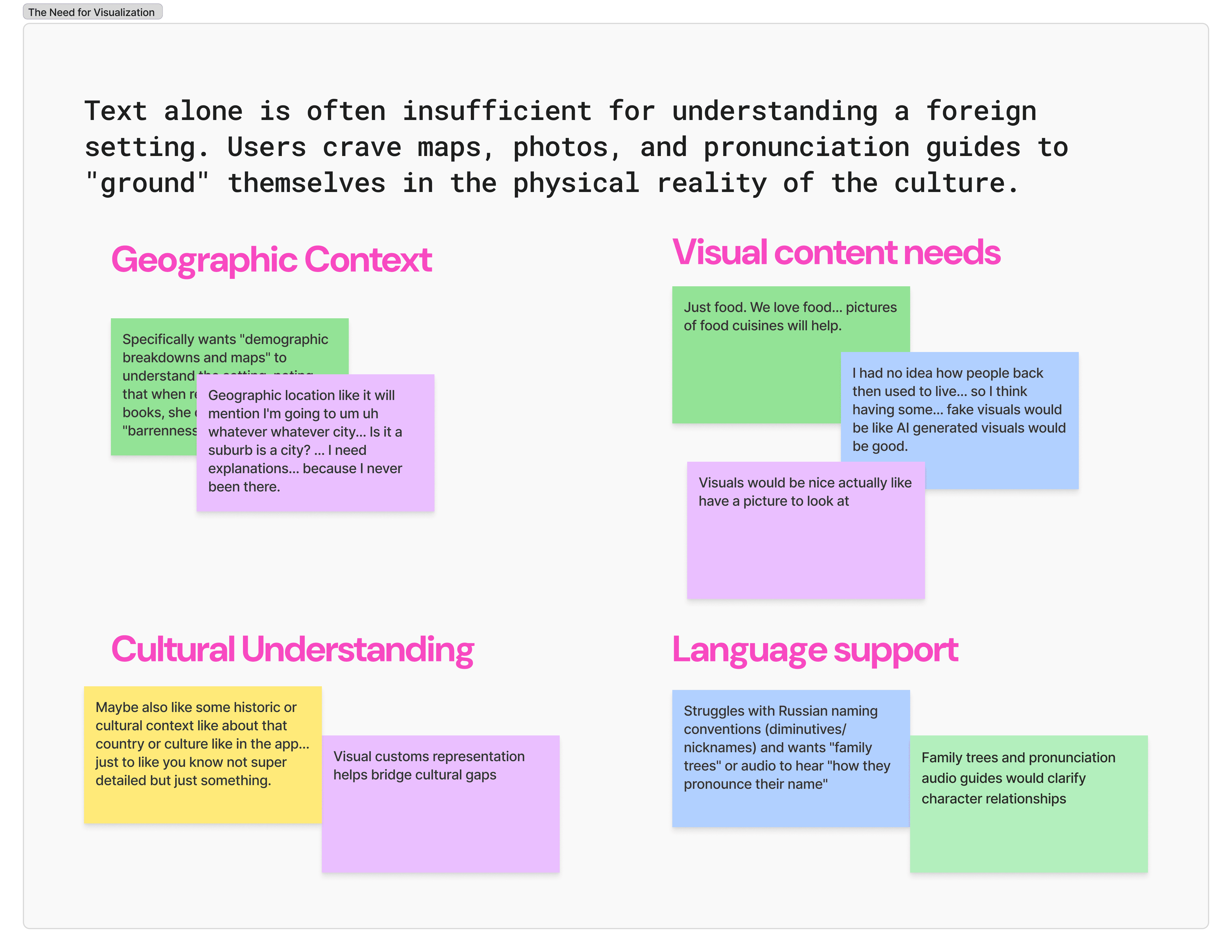
Readers cannot picture foreign settings, clothing, food, or landscapes they've never encountered, so they need visual and contextual support to inhabit an unfamiliar world.
Two needs cut through every interview and ended up settling the form: immersive reading that never breaks for an unknown word or reference, and visual grounding that helps a reader feel inside an unfamiliar culture. One protects the flow; the other builds the world. Those two needs became the two reading mindsets I designed for.
Two mindsets, one reader
Those two needs took shape as two reading mindsets, and then two personas: the Immersion Reader, who craves dense cultural depth, and the Cultural Voyager, who looks for visual entry points and light guidance.
In practice, the same person moved between both, depending on mood, energy, and how familiar they were with the culture. Instead of pigeonholing readers into rigid personas, Lumi's experience is shaped around these shifting mindsets so readers can choose depth or light-touch support as they need it.
Chen
28, Business Analyst in New York. Chen reads for the real cultural depth, not a quick definition, and won't risk a spoiler to get it.

- Translations flatten the original political and historical meaning.
- Googling mid-chapter risks spoilers and breaks immersion.
- He has to leave the book to understand a single reference.
- Dictionary tools stop at definitions and miss the cultural meaning.
- Inline, footnote-style context that never leaves the page.
- Verified, source-backed explanations he can trust.
- The nuance lost in translation, recovered in place.
- Depth on demand, surfaced only when he asks for it.
Sarah
28, Freelancing Tattooist in Oakland. An avid traveler, Sarah reads to explore worlds she can't fly to, and needs to picture the setting, not just decode the words.

- She can't picture unfamiliar settings, food, or landscapes.
- Reading foreign literature alone feels isolating.
- She gets lost when a book assumes cultural knowledge she lacks.
- Browsing is organized by genre, not by country of origin.
- Visual aids and maps that ground the world of the story.
- Light, on-demand guidance she can ask for.
- A way to discover books by country of origin.
- To feel present in the world of the story.
Opportunities: designing the missing cultural layer
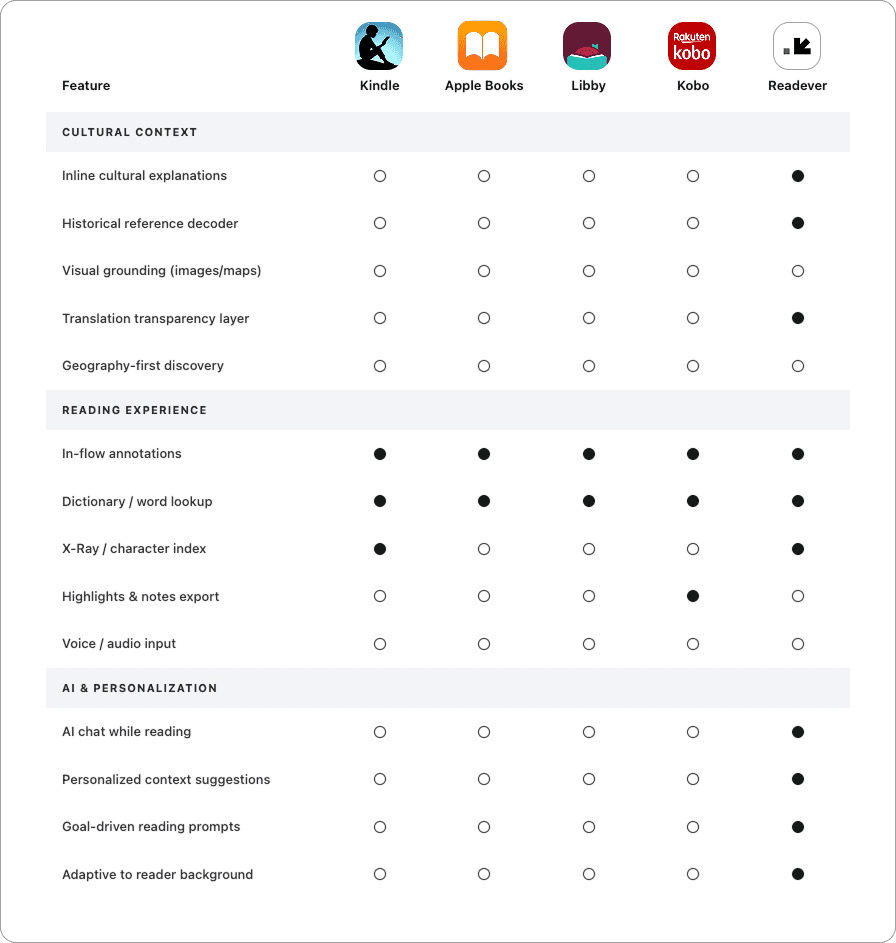
Most reading apps stop at utilities: dictionaries, highlights, and basic X-Ray views that list characters but ignore cultural nuance. From the feature matrix, I saw the same gaps repeated across Kindle, Apple Books, Libby, and Kobo: no in-line cultural explanations, no visual grounding, no sense of how “culturally dense” a book might be before readers start.
With Lumi, I started designing the missing layer: an in-flow cultural companion that surfaces context, visuals, and AI-driven explanations only when the reader needs them, so non-native readers can stay immersed in the story instead of bouncing out to Google.
One flow, two mindsets
How might we bring the cultural context a native reader already carries inside the book, so non-native readers stay immersed instead of leaving to search?
High-level goals:
- Surface “hidden” cultural meanings that a reader wouldn't even know to ask about.
- Integrate visual and sensory cues into the reading experience to help readers “see” the world behind the text.
The fork: a cultural library, or a smarter reader
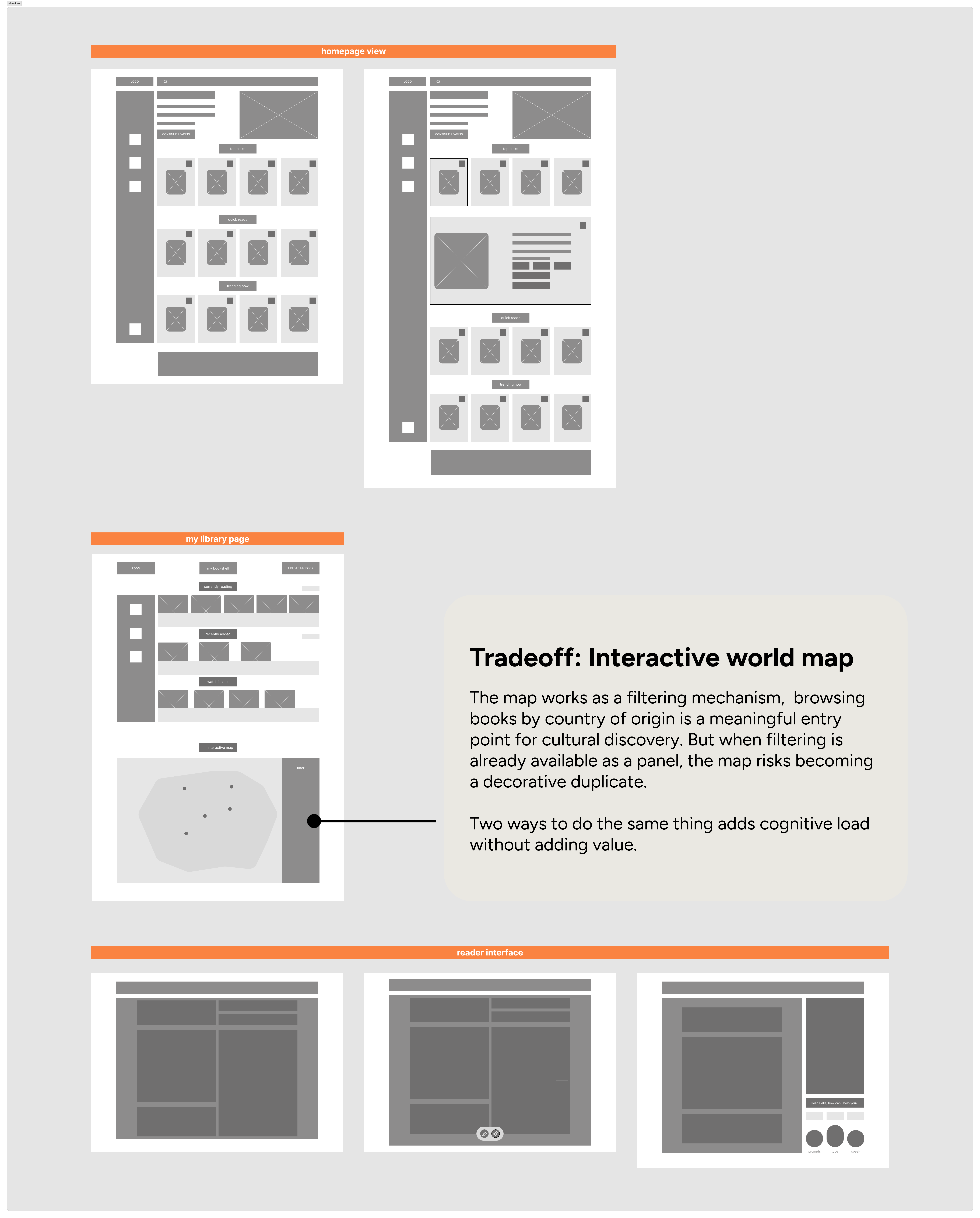
This is where the form question from the interviews came due. The other Lumi was a library-first product: a curated shelf of non-Western literature, browsable by culture and country of origin, with an interactive world map to explore books by region.
It was the more obvious idea, and the more buildable one. But it solved discovery, not comprehension, and the interviews kept pointing at comprehension: readers weren't short on books, they were short on context once they were inside one. So I set the library direction aside and committed to the reader, keeping only the lightest discovery layer the flow actually needed.
The web app then narrowed to three main pages: a homepage, a library for saved books, and the reader interface where you read alongside the Lumi agent.
Instead of designing separate journeys for two different personas, I kept one core Lumi flow and explored how the same reader moves between a “visual discovery” mode and an “immersive reading” mode.
Mood board and UI kit
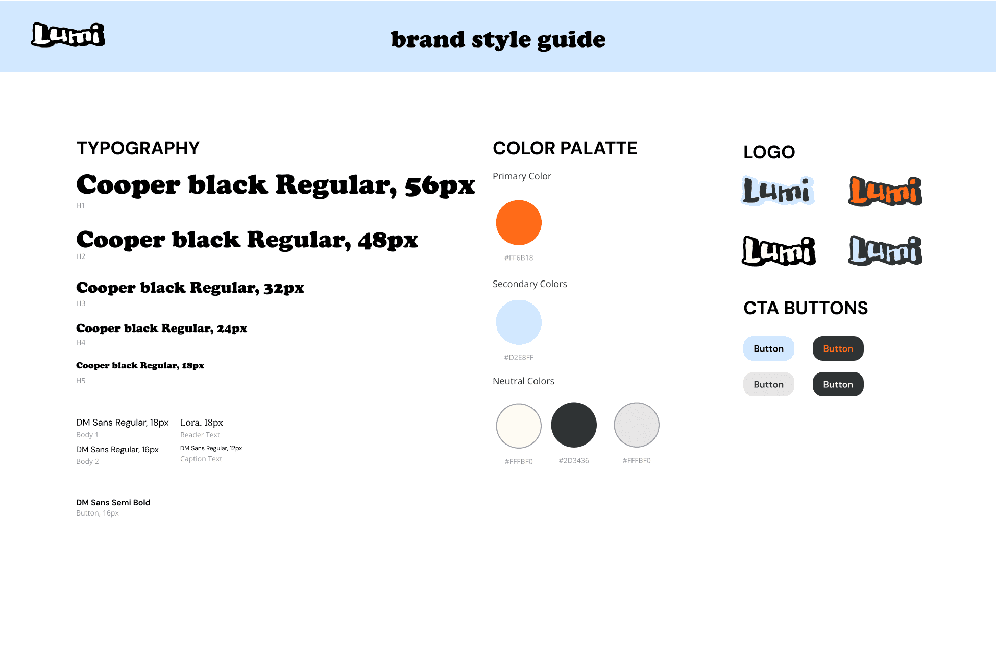
Many reading apps make non-native literature feel solemn or academic. For Lumi, the goal was the opposite: a warm, Gen-Z-friendly space that makes exploring a new culture feel playful and approachable.
That's why the visual language leans on a creamy base, bold accent colors, and expressive typography, supportive, curious, and a little quirky. The interface stays clean and editorial so the page still feels like a book, while vibrant visuals and micro-interactions carry the excitement of discovering something new.

Context, inside the book
So here is what I built. Lumi surfaces what sits beneath the words: the history, the subtext, the things a native reader already knows, without breaking the flow that makes reading worth doing.
Decision 1: a reading journey that focuses on discovery
Readers land in a browse-and-explore flow, more like scrolling a streaming shelf than scanning a bookshelf. Every card leads with context tags and a tight hook, so committing to a book takes seconds, not more scrolling.
Decision 2: in-context agentic reading without breaking the flow
Readers shouldn't need to leave a sentence to understand it. Just highlight a phrase and tap the floating button on the left. Lumi reads the surrounding passage and surfaces a contextual explanation inline, answering the question before readers fully form it.
Quick-tap tags ground the concept in a broader framework; follow-up prompts anticipate where curiosity goes next, giving readers a live, structured path deeper into the reading flow without ever leaving the page.
Not every moment in a book calls for deep analysis. Lumi defaults to a compact summary beside the passage, and the full breakdown only appears when a reader taps “dive deeper” or asks a direct question. Depth scales with curiosity, so the page stays clean until the reader wants more.
Decision 3: context-driven visuals, zero typing
The system reads the passage and surfaces grounding prompts automatically. Readers stay visually anchored in unfamiliar cultural content without ever touching the chat.
Decision 4: a library page for a friction-free, personalized reading experience
The library surfaces books by reading state, with genre tags that let readers slice into sections without hunting. Tap a tag and the shelf reshapes. Progress and completion are visible at a glance, so the library works as a real management tool.
What clicked, what didn't

All four interviewees immediately understood the value: staying in a story while getting cultural context on demand. The quick footnote-style cards felt natural, almost like something readers were already doing manually (Googling mid-chapter, flipping to footnotes). Trust was immediate.
The deeper analysis panel is a different story. Most readers didn't want it mid-scene on a first read; they framed it as “study mode,” something for Shakespeare or a second pass. Surfacing it automatically might interrupt the immersion it's supposed to protect.
Next steps
- Enrich the library cards. Readers treat the library as a working shelf. Surfacing completion status, percentage progress, and download state on each card would make it genuinely useful as a management tool, reflecting how readers already think about their books.
- Make the AI hierarchy obvious. Quick cards and Ask Lumi serve different purposes, but right now they read as two versions of the same thing. Renaming Ask Lumi to something like “Deep Dive with Lumi” and triggering it from within the quick card would make the relationship feel intuitive, not something that needs explaining.
- Study mode and community notes (lower priority). Several readers unprompted described wanting a mode built for deeper, more analytical reading: longer breakdowns, external sources, and richer context. A “Study mode” toggle would unlock that without pushing it into the default experience. Pairing it with community-sourced context is also worth exploring as a trust layer as the product matures.
Takeaways
Lumi is what happens when I design for a problem I've lived. It started from the same film I'd spent years peeling back alone, and it became an end-to-end reading platform where the intelligence stays quiet until you reach for it. Here is what shaped how I design now.
Systems thinking requires zooming out, or you miss the basics
I went so deep on the agentic reading experience that I missed a basic feature, the library filter. UX has to hold the full journey, not just the immersive moment.
One reader, many mindsets
The same reader moved between Immersion Reader and Cultural Voyager depending on mood and familiarity. Designing for mindsets that shift with mood and familiarity led to more adaptive patterns than any fixed persona could.
Agentic AI should be proactive, secondary, and transparent
Users hesitated to lean on the AI when they couldn't predict what it would do. Clear hand-off moments and progressive levels of help mattered more than polished visuals.
Delight without discoverability is invisible
I over-invested in micro-interactions, and some users never noticed the AI at all. Benefit-driven labels and cues did far more than polish to show what the feature actually does.
That's the end of this story. If you're still curious, here are two more.