
Giving X users real control over their feed
We all spend so much of our screen time on X these days, scrolling to keep the FOMO at bay in a post-AI world, and yet the algorithm decides what we see while we barely get a say. I redesigned feed control so both intentional and exploratory users can shape their own feed directly, through one flow that fits inside X's existing ecosystem.
- design
- mobile app
- my role
- sole product designer, ux researcher
- duration
- Feb 2025 - March 2025
Putting users back in control of their feed
I didn't join X until 2021, since the Great Firewall kept it out of reach while I was in China. When I finally signed up after moving to the States, I bounced off immediately. The feed felt like walking into a crowded room where everyone was shouting at once, so I mostly left the account alone.
Now that I'm breaking into tech as a junior designer, catching up on everything while trying to hold onto a wholesome personal life, that early friction has stuck with me. X has interest-based controls under the hood, but they're buried, inconsistent, or just missing. You're either fully at the mercy of the algorithm or muting your way to sanity.
This project is about changing that: giving users real agency over how their feed looks and how the algorithm weighs their interests.
All algorithm, no agency
- The more an algorithm knows and decides, the less agency an average user has.
- The platforms that chase engagement metrics most aggressively tend to be the ones that ask users the fewest questions about what they actually want.

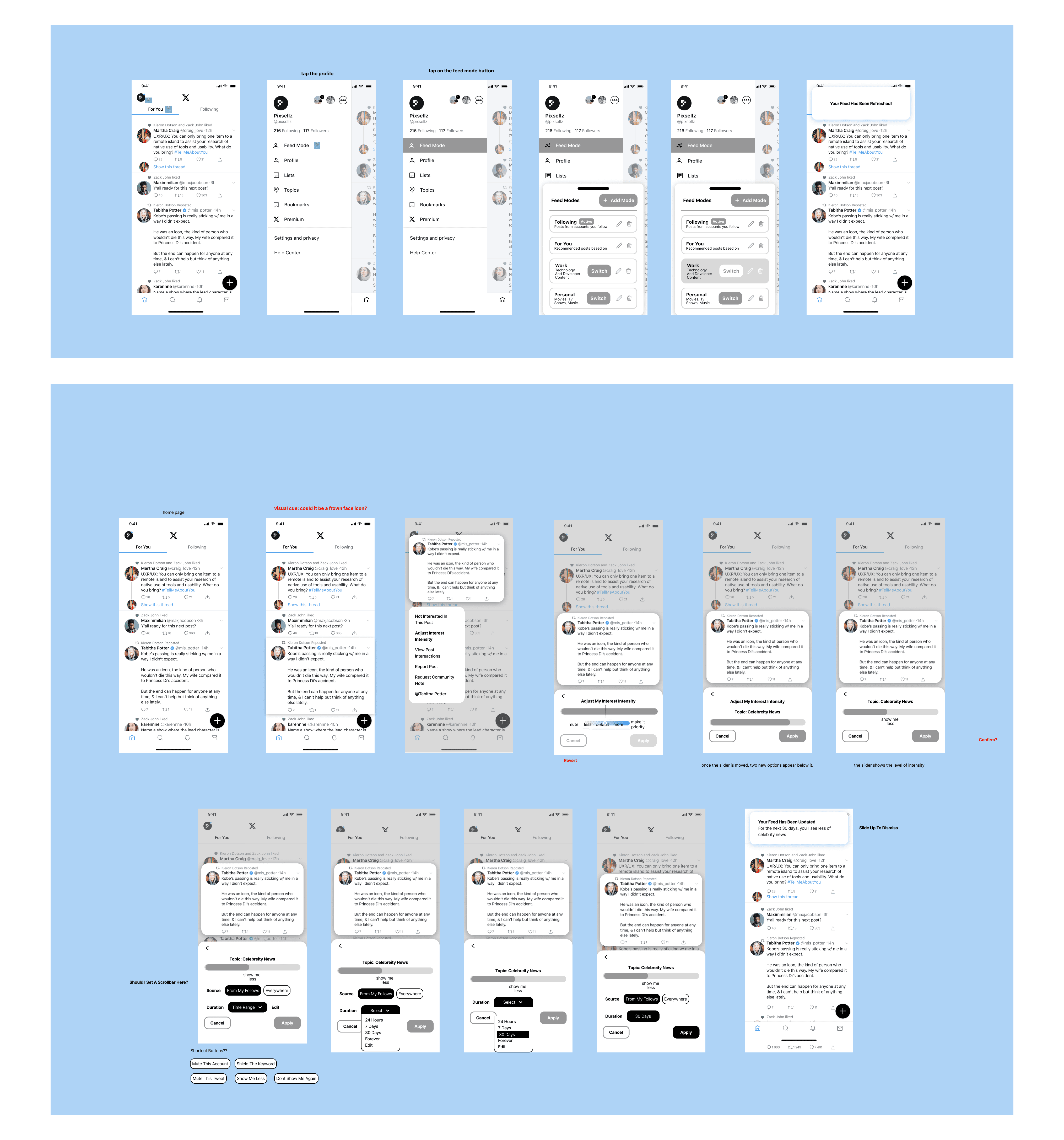
Two ways to take back control
Two features give users real agency over their feed: one for switching modes on the fly, one for tuning what the algorithm weighs, each built to fit the way X already works. Tap a feature to see its prototype.


What I learned from users
I interviewed five participants about how they actually manage their feeds, then mapped the patterns. Two broad pain points surfaced first.
The algorithm runs the show
X mostly decides what you see, and the handful of controls that do exist barely move the needle. Recommendations miss, your interests blur together, and you end up just taking whatever the feed serves up.
I'm on X for laughs and giggles. If I see Political or BBC, why do I care?
Ghost interests that linger
Topics you cared about months ago keep resurfacing with irrelevant content, and there's no easy way to prune them.
After an event is over, I have to go through and mute the event's hashtag and maybe even unfollow some accounts. It's a manual cleanup process.
Affinity mapping
Users desperately want granular control over their feeds, but current tools are hidden, ineffective, or nonexistent.
Mapping the interviews broke those two broad pains into four concrete needs, self-control, transparency, cognitive load, and relevancy:
I don't want to see content made by other people. I actually just want to see my friends' stuff.
- Control that integrates into existing workflows, not a separate chore.
- Immediate utility over educational explanations.
- Context separation; people resort to multiple accounts as a workaround.
- Controls that are exceptionally easy to find, not buried in settings.
If I have to go into a settings page and manually configure it, I'm way too lazy to do that.
A clear split in user behavior
Those needs didn't point to one average user. They split cleanly into two mindsets, and any solution had to serve both without forcing friction on either. They became the two personas I designed for:
The Intentional
Opens X with a specific goal and prioritizes efficiency. Irrelevant content isn't background noise to them, it's friction in the way of why they came.
- Off-topic posts derail a feed they opened with a clear purpose.
- Existing controls are too blunt and too buried to fix it in the moment.
- Granular control over what the feed surfaces, on demand.
- Controls that sit inline, not three taps deep in settings.
The Explorer
Opens X to browse and enjoys algorithmic surprise. Happy to be led, and unwilling to spend time hand-curating a feed.
- Heavy curation tools feel like work, so they go unused.
- Ghost interests keep resurfacing content they've already moved on from.
- Quick, optional tweaks, never a setup chore.
- A light way to nudge the feed without managing it.
User and business alignment
Users prioritized transparency and trust, wanting clear, direct control over their feed with minimal cognitive load, while the business wanted to deepen engagement and strengthen its reputation by respecting those same users.
This alignment revealed a clear opportunity: to design a feature that is transparent, safe, and effortless to use.

One flow for two mindsets
How might we give people meaningful control over their feed without turning it into a chore, so users across different needs get a feed that actually fits them?
I merged two separate features, feed-mode control and top-interest intensity, into one connected experience: serendipity for exploratory users, total control for intentional ones.
Now users can either make quick, one-tap changes on the fly or dive into a central menu to fine-tune exactly what they see. Most importantly, any quick tweak made directly on a post is automatically saved to those main settings, so users never lose track of their adjustments and can always undo them later.

Testing and tightening
Usability testing and next steps
All four participants were also interviewed during the usability testing phase. I tested two flows across three tasks, with a 100% completion rate and no signs of drop-off.
Next steps:
- To reduce nesting, move the customization option up in the hierarchy, perhaps as part of the mode / profile-avatar quick menu.
- Consider an onboarding overlay or info tooltips for first-time switch usage, briefly explaining the value and result of the customization features so users understand why and when to use them.
Lessons learned
Two scattered controls became one flow that serves opposite mindsets, and it tested at 100% task completion with no drop-off. It's the project I point to when I want to show I can add real agency to a mature product without fighting the patterns it already has.
Don't project your design thinking onto users
- Don't design for the average user; design for both ends of the spectrum and the underlying mindsets that drive their behaviors.
- Don't force decisions on users who don't need them. Offer quick, non-mandatory options instead of pressuring them.
Systems thinking for a mature ecosystem
Going in, I didn't really have a systems-thinking lens, so I spent a lot of time working out how to fit new solutions into X's existing ecosystem. This solidified my ability to integrate new features into a complex, existing ecosystem while maintaining strict UX consistency and usability. Next time, I'll consider scalability and adaptability from the start.
That's the end of this story. If you're still curious, here are two more.