Period - cycle & period tracker mobile app
How can a cycle tracker serve multiple personal needs while requires minimal input to make menstruation less painful?

the problem
Current period tracker apps fall short in meeting user's needs
Privacy Issues
84% sharing intimate health data with third parties for marketing and research purposes.
One-size-fits-all approach
Current apps are criticized for generic advice, no personal analysis and limited symptom tracking options
Inaccurate Predictions
Most apps assume regularity and don't allow corrections when predictions are wrong.
Feature bloat and aggressive monetization
Unnecessary tracking options, pushy paywalls, and potentially harmful features like weight loss tracking.
the solution
Designed with empathy and cultural awareness, Period moves away from fertility-focused narratives to embrace holistic well-being and body harmony.
By offering personalized cycle insights and culturally-sensitive design, users now take control over their menstrual health beyond basic tracking. The platform provides privacy-protected predictions for irregular cycles, customizable features that adapt to individual needs, and an inclusive aesthetic that respects diverse backgrounds.
Calming & Supportive experience
Period combines hormone tracking, menstrual cycle logging, wellness and personalized advice into seamless user experience
Personalized daily advice
Highly personalized insights in the form of workout, nutrition, skincare, and self-care suggestions tailored to users' phase
Manual, Calendar-Based Input
Users can tracker their cycles / phases manually within the mobile app and receive tailored insights
Cycle Symptom Tracking Interface
Period visualizes where the user is in their hormonal cycle and offers phase-specific information through educational articles
🦻 qualitative research
User Interviews to stay focused on the whys behind users' choices
I interviewed 7 people aged 22 to 35, who are taking various approach to log their menstruation cycles and the reasons behind their choices. I wanted to learn why they chose current approach, how they do it, what works, what didn't, and what tools they wish they had.
Reliable Predictabiity
The primary motivation for tracking is often gaining predictability for life planning (work, travel, social) and feeling in control of their bodies. Inaccuracy often undermines trust and the core utility for planning.
🦻 affinity mapping
Post-interviews, I used affinity mapping to synthesize the data points and categorize them into themes
5 major themes were revealed to see what concerned the participants the most based off of interview answers

prediction accuracy
personalized & holistic insights (no generic advice, personalized summaries, pattern analysis that’s beyond dates)
others (perid alerts, integration with other devices, etc)
🙋 hmv questions to user personas
How might we help users feel prepared, require minimal user input, and provide personal insights ?


🖌️ from research to ideation
Translating Feature set and sitemap to Task flows
Feature Sets
task flows
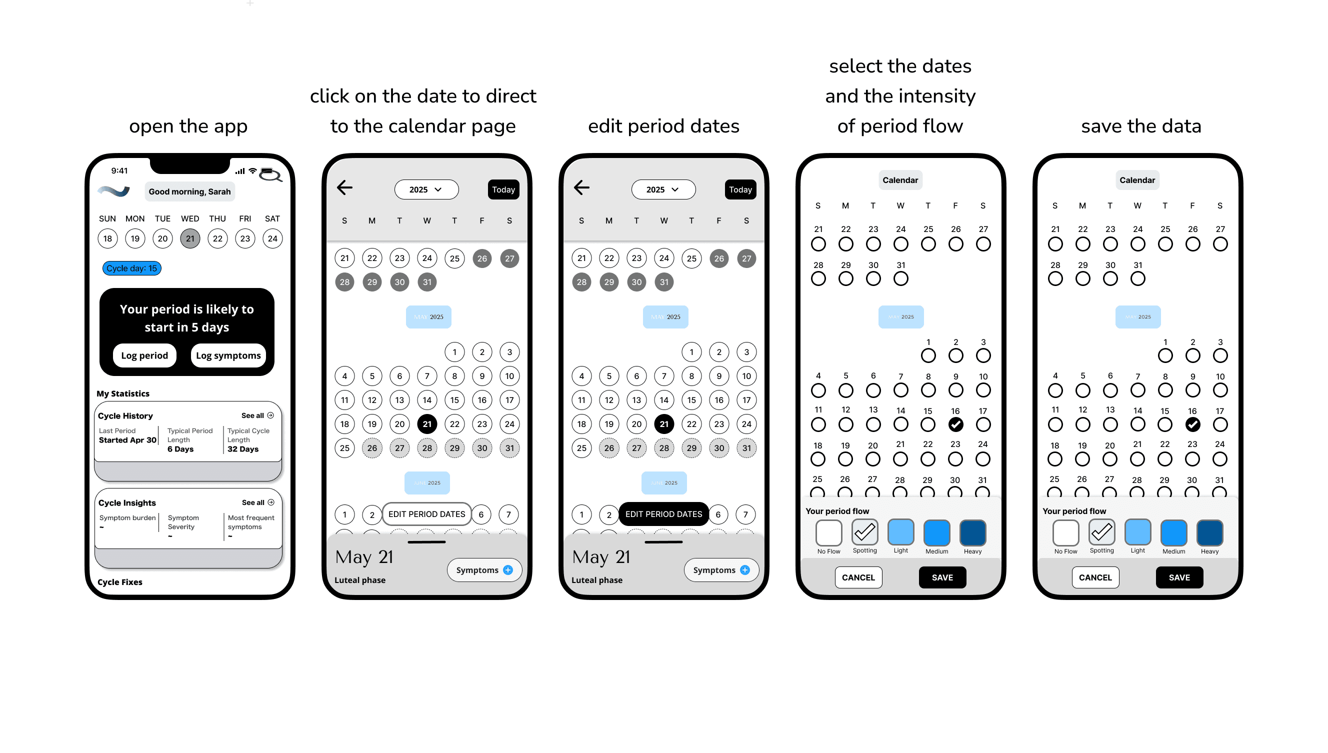
task flow 1: editing historical data
Validate that the editing process is intuitive and users can easily navigate to historical data without confusion
Identify confusion points and users can easily distinguish between current and historical data while making accurate corrections.


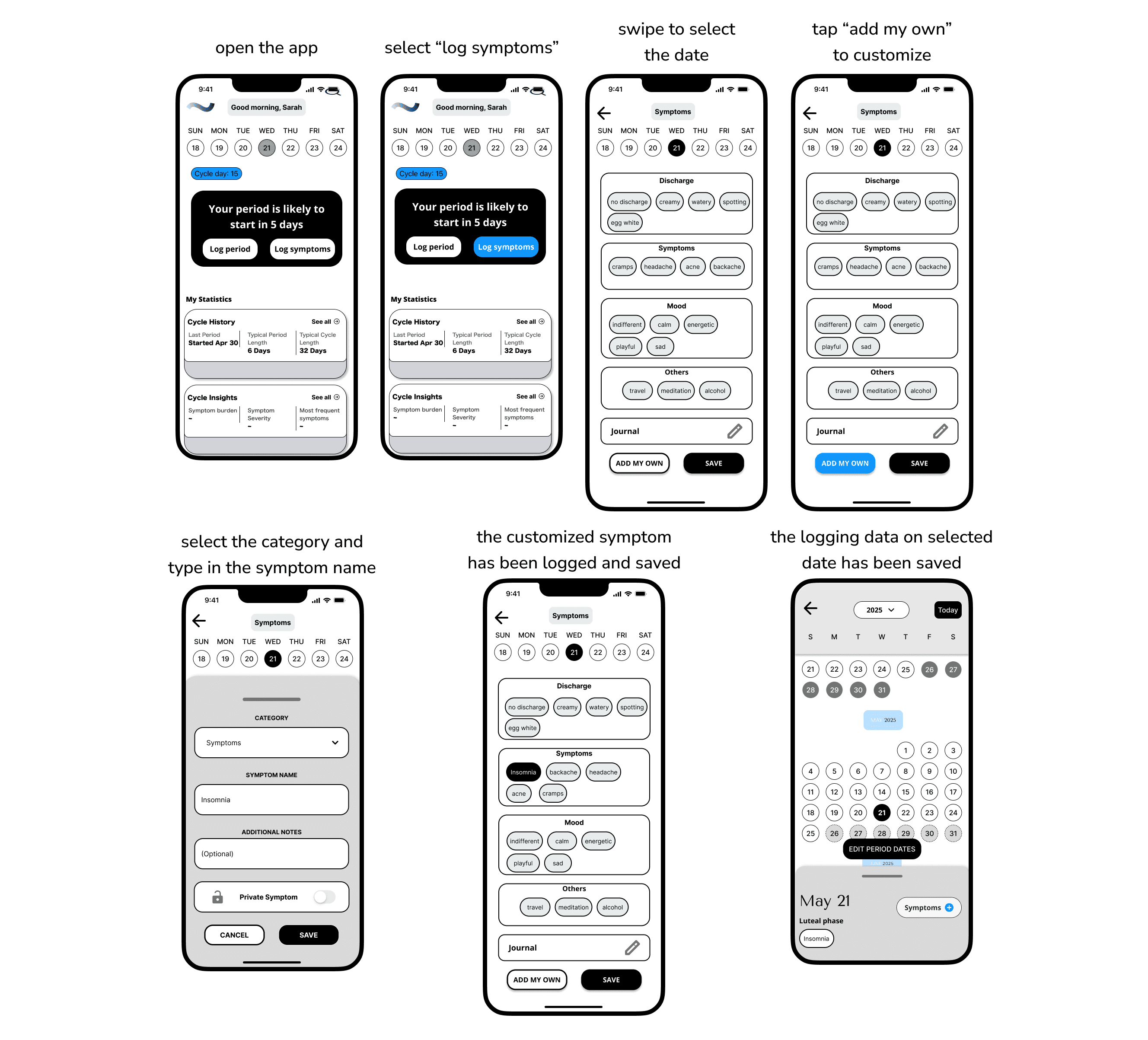
task flow 2: logging a customized symptom
Identify friction points that might cause abandonment while ensuring complex tasks don't overwhelm new users.
Ensure the customization process is discoverable and straightforward without overwhelming users with complexity.
Based on current insights and to make the MVP lived in real-life experiences, both of these two core user tasks are related to the key actions that users might take to note down her their body variation during menstruation.
📒 iterations
Multiple Iterations later, from wireframes to
higher fidelity
mid-fi wireframes
During the mid-fi phase, for the first task, I overhauled the homepage interface. The mid‑fi introduces clearer hierarchy and actionable controls, showing a structured card layouts, instead of card blocks. Overall it feels more scannable, and task‑oriented than the low‑fi one, which was more generic and blocky in structure.
The UI now supports the period‑editing task with explicit flows, with labeled states, and tappable affordances that reduce ambiguity and cognitive load.
For the symptom logging flow, the mid-fi one now feels more customizable, and confirmable than the low‑fi, with guided entry points and editable bubbles. Explicit save states that reduce ambiguity and increase confidence logging sensitive data.
It also aligns with a supportive tone and daily check‑ins by making customization first‑class without overwhelming the base categories.
🌺 brand visual guidelines
How might we express Period’s message through consistent and emotionally related visuals?
To reinforce Period’s mission and values, I developed a brand visual guideline that translate strategy into storytelling that's not just consistent, but also emotionally inclusive across all touch points.
I focused on maintaining clarity and accessibility while adding warmth and personality through color, typography, and layout.
For color palette, I blended deep navy, soft lavender, and sunny yellow with gentle pastel blues, which help creates a space that feels both trustworthy and uplifting. Calming blues and purples lower stress during daily health check-ins. A pop of yellow adds warmth and optimism, keeping the app from feeling clinical while encouraging engagement.
For typefaces, I selected Tenor Sans paired with Open Sans. The two creates a warm, approachable combination where the distinctive headers contrast nicely with the familiar, readable body text.
The brand logo uses a single, flowing wavy line that suggests movement, flexibility, and natural cycles, reflecting the ebb and flow of menstrual health.

🔍 High fidelity & prototyping
Applying the visual language to bring the wireframes to life
With the brand identity and design system in place, I put everything together into high fidelity wireframes by applying the visual language, which enhances accessibility and usability, thus bringing the design to life.

Try it out
view prototype
🎙️ key findings after usability testing
Making sure that the product works not just in theory, but also in users' hands
The usability testing mainly focused on out two task flows, and we also asked users to comment on our dashboard, calendar view and symptom screens based on their understandings, and if the information conveyed on each screen is clear, visible and easy to navigate.
Participants wanted a stronger visual feedback that reflects their action states after completing each task.
Participants preferred a more intuitive and personalized experience, such as a customizable symptom screen to prioritize desired categories.
Low icon affordance caused frequent misclicks and confusion during testings.


🧠 Key learnings recap
Small details enables users feel seen and help smooth the whole user experience. Every decision centered on reducing overwhelm, and it reinforces itself after taking the usability test with target users. It vividly showed me how important users feedback is, and reminded me that cutting complexity and choosing “enough” over “everything” has always been the key.
Clear Visual Confirmations are Essential. Testing confirmed that users need immediate visual feedback after every key action, such as saving a date or creating a symptom. This feedback reassures them of success and reduces the uncertainty that leads to abandonment.
A Consistent Design System Creates an Effortless Experience. When both task flows used the same visual patterns for buttons, forms, and navigation, it created a predictable and intuitive experience that significantly lowered the cognitive load on users.