From Data Overload to Action-driven Educator Dashboard
My team delivered a polished dashboard that didn't help teachers act, built on a tight 4-week timeline. After the engagement wrapped, I took it back solo and reframed it from data display into one decision flow. (Names changed for NDA.)
- design
- Desktop App
- my role
- product designer, ux researcher
- duration
- Feb to March 2026
Reframing a dashboard around decisions, not data
This educator analytics dashboard began as a 4-week team project: I led UX, another designer led UI. Working from an ambiguous brief, we shipped a polished but static dashboard that looked credible and did little to help teachers act.
After the engagement wrapped, I took it back on my own and reframed the problem from data visualization to decision support, turning a chart-stacked screen into one connected workflow where teachers can spot cross-class learning gaps and send an AI-supported remedial plan in a single flow.
From charts to decisions
This is the educator analytics dashboard for an AI-supported learning platform. Here's the home my team first shipped, and the version I reframed it into.

Building to spec, not solving a problem
The brief handed us a feature set but no user stories, no personas, no success metrics. With no picture of who we were designing for or what “better” even meant, we built to spec, optimizing a list of features instead of solving a problem we could name.
It surfaced fast in testing. Teachers couldn't tell what each chart was meant to show them, let alone what to do next. The dashboard looked credible and did nothing.
Context and design opportunity
V1's risk-level tags labeled students without giving teachers the context to act on them. The signal was there. The story wasn't.
The gap crystallized when a teacher asked mid-interview: “What am I supposed to do after seeing this?” Every feature had been built as a data display, not a decision-making tool. That question became the design problem I took on independently after the project wrapped, going back to the original interviews and the feature matrix to reframe what the dashboard was even for.
What teachers actually needed
I dug back into our interviews with 5 educators: one elementary teacher, one high-school teacher, and three professors. Despite differences in workload and setting, they shared one core problem:
Teachers need a connected and simple workflow to help with feedback from student performance.
User personas
I built two personas to capture the distinct needs I found while synthesizing the interviews.
David
38, university professor in New York. David values rigorous, logic-first coursework and wants a tool that teaches, not a dashboard that proves a student logged in.

- Grading creative work objectively is hard; there's rarely one “correct” answer.
- Spends more time on logistics (uploading, grading, sorting) than on mentorship.
- Heavy upfront course-building crowds out time for personal guidance.
- Automation that streamlines the workflow, not one more dashboard to maintain.
- Subtle early signals of learning gaps, to intervene before failure without surveillance.
- AI that flags reasoning errors and prompts deeper thinking, not fully-solved answers.
- A guided path that links lecture, reading, and exercise.
Sarah
34, high-school teacher with 150 students. Sarah refuses generic feedback but is buried in administrative work, so struggling students surface too late.
- Generic comments don't help, but detailed feedback for 150 students takes 15+ hours a week.
- Struggling students surface only after a bombed exam; early signs are buried in admin noise.
- Fears a new tool is just “one more login” that doesn't talk to her gradebook.
- To know who's confused today, not next week when grades post.
- To shift from correcting grammar to coaching ideas, without adding hours.
- One cohesive workflow that surfaces meaningful patterns automatically, no extra setup.
- Insights that connect to her gradebook instead of another disconnected dashboard.
Finding the loop beneath the features
How might we turn scattered student performance data into one connected workflow, where AI helps teachers see who's falling behind and respond with ready-to-send support?
Information architecture
Rather than re-designing around the given feature list, I mapped 4 sample scenarios into parallel feature tracks. What looked like a disconnected menu of features revealed a circular loop between analytics and action: a teacher creates content, assigns it, tracks progress, identifies gaps, and acts. That sequence became the spine.
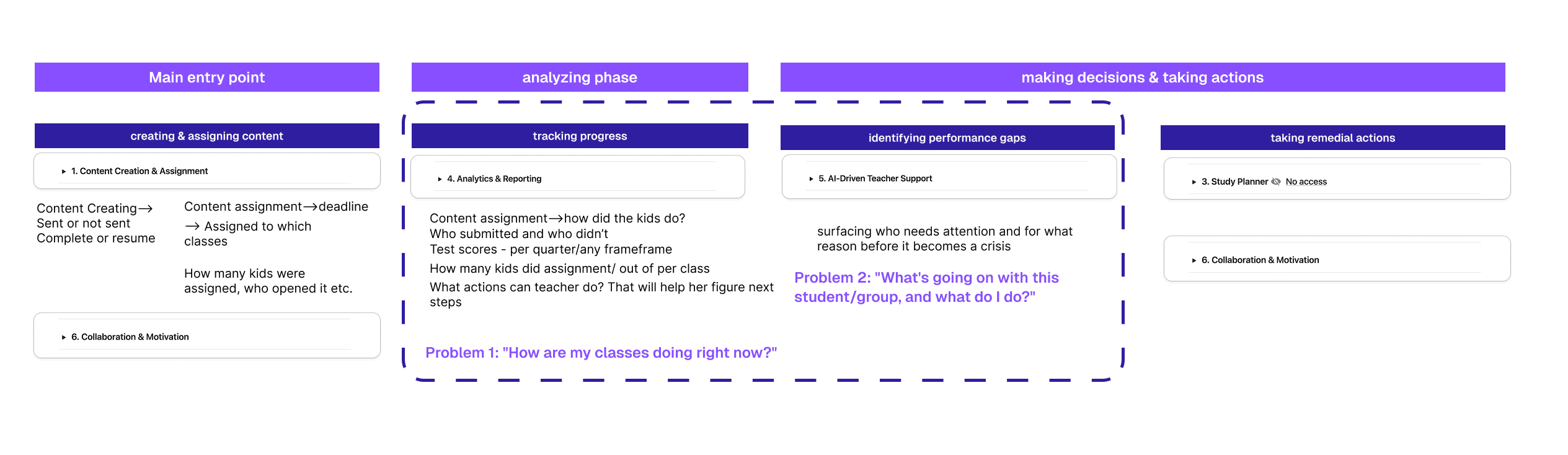
Create → Assign → Track → Identify → Act
The dashboard owns the Identify → Act handoff, the moment a teacher goes from “I see a problem” to “I’ve responded,” reading the Track data that piles up after each assignment to surface who needs help. Features like exporting, parent reports, and operational utilities were deliberately set aside, keeping the primary decision flow coherent rather than comprehensive.
Design scoping
The five-stage workflow sharpened the user story for a teacher entering the dashboard: spot the outliers who need help, then package remedial work for them through the AI tools. The flow also accounts for the gap between assigning work and getting the report back, the window where student collaboration happens and reminders go to anyone who hasn't submitted yet.
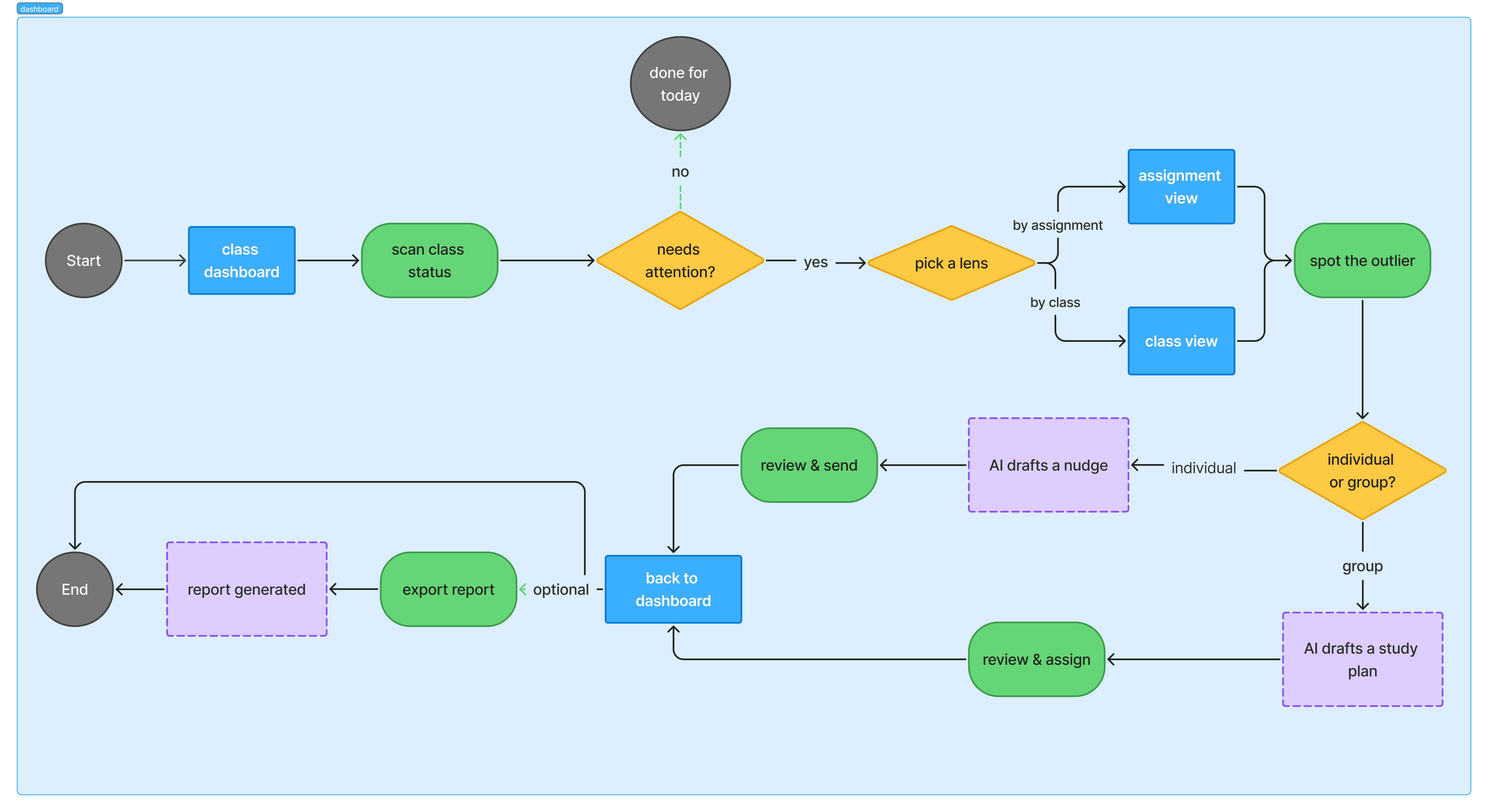
One connected decision flow
Solution 1: two-step filtering tabs
Managing assignments across multiple classes creates a constant tension: teachers need both a wide-angle view and a close-up lens, but switching between them is slow and disorienting. The two-tab system resolves this by anchoring each view to a distinct intent.
- Filter by Class, for course-level management. Teachers instantly see all assignments tied to a specific class, with direct access to actions like exporting progress reports for that cohort.
- Filter by Assignment, the view teachers reach for right after sending work. They get an immediate “who, what, when, and why” snapshot of a recently sent task across every class, without navigating away.

Solution 2: smart nudging system
A communication tool lets teachers send reminders to specific groups of students, like those who “have not yet submitted” or were “absent,” using smart recipient selection instead of manual cherry-picking. Tone is adjustable to fit each nudge.

Solution 3: AI-driven teacher support
This feature suggests next steps, like triggering a study planner or remedial work for students across different classes who struggled with the same lesson. Teachers can customize the order and delivery, sending it immediately or scheduling it for later.

How each solution evolved
Two screens carried the redesign. Here's how each one evolved from a passive display into something teachers could act on.
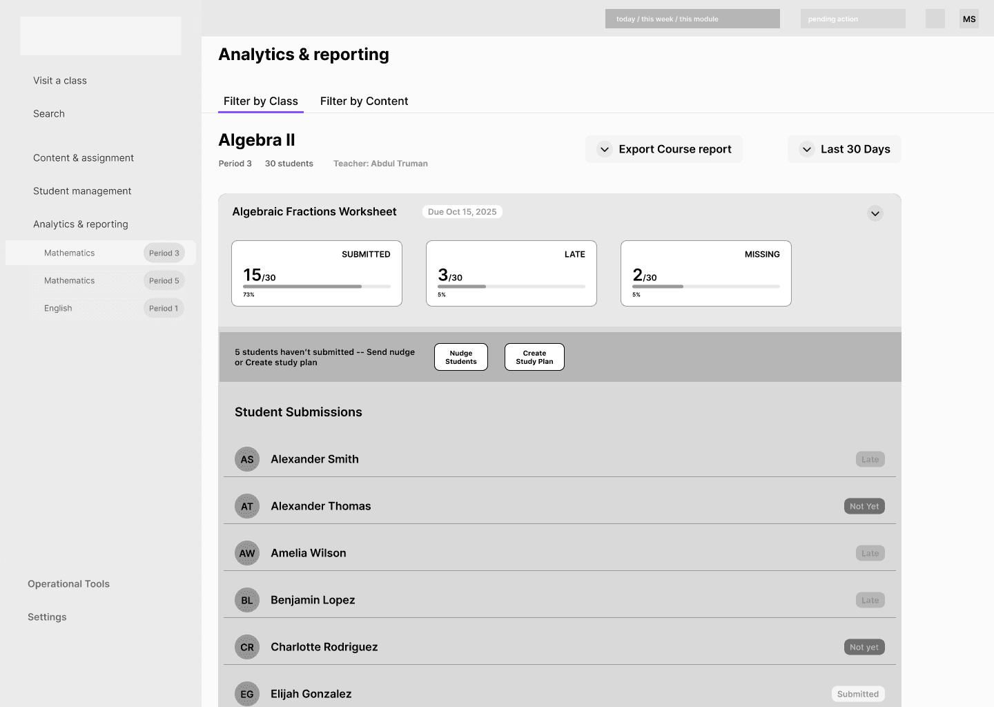
Student list as an action surface
The per-assignment view where teachers review who submitted, who is late, and who is missing.
The Problem
A passive status report that forces teachers to act on each student one by one, slow, fragmented, and context-free.
Solution
Checkboxes, filters, and per-row controls let teachers group outliers and send a nudge or study plan without ever leaving the list.

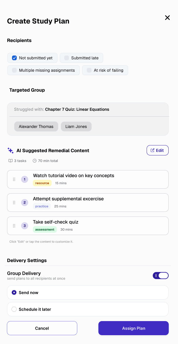
Remedial work you can steer
The Create Study Plan flow that packages follow-up work for students who fell behind.
The Problem
A general text-based remedial suggestion that teachers had to approve with little to review.
Solution
Sequenced activity types and time estimates are visible before anything is sent, so teachers can review and steer the content rather than approving it blindly.

Outcome and reflection
The reframe turned a screen teachers only looked at into one they could act on: see who's falling behind, then send AI-supported support, without leaving the flow. It's the project I point to when I want to show how I work in ambiguity, finding the real problem before designing the answer.
What went well
- The brief gave us features, not a problem. The work got better the moment I stopped building to spec and went looking for the decision teachers were actually trying to make.
- When testing surfaced confusion, that was the signal to reframe, not to polish. Attaching every screen to a clear next action did more than any chart restyling could.
What could be improved
- Let teachers customize how classes and courses are grouped, so the dashboard fits their own structure instead of a fixed one.
- Rather than manually editing each content piece, a future iteration would replace manual content edits with a lightweight axis UI: adjust intensity (difficulty level, depth) and learning dimension (focus areas, topic scope), and the AI regenerates accordingly. Less authoring, more calibrating.
That's the end of this story. If you're still curious, here are two more.