From Data Overload to One-Click Action
Reworking on the client project under ambiguity to streamline a decision-driven analytics dashboard experience
Overview
By reframing the design problem from data visualization to decision support, I turned a chart-stacked dashboard into a coherent educator workflow, one where teachers can spot cross-class learning gaps, and deploy an AI-supported remedial plan in a single connected flow.

Design
Desktop App
My role
product designer
timeline
Feb - March 2025
industry
EduTech
the problem
Co-Design Dashboard Under Ambiguity = we delivered a dashboard that's of no use
The brief was no sample scenarios and user stories at all.
The brief handed us a feature set and nothing else. No user stories, no personas, no defined use cases.
users failed the usability test because the deliverable made no sense to them in real life
V1 shipped with charts that looked credible but answered the wrong question: "what's happening?" instead of "what do I do about it?"
I got my interviewee asked: what am i supposed to do after seeing this data? It was then I realized that our visually polished deliverable makes no sense to them in real life, Without that backbone, every feature became a chart for its own sake, and that gap became the design problem I chose to solve independently.
context / opportunity / design goal
I turned messy data into a one-click remediation plan: the "so what" that V1 never answered
V2 is a hi-fi wireframe and prototype mapped to the educator’s five-stage journey, not a chart dashboard, but a decision workflow. While V1 expected teachers to extract meaning from raw metrics independently, V2 surfaces the next right action directly: identify underperforming students, draft the nudge, generate the remedial plan, deliver it - all from one connected flow.
The original design answered "what's happening?" V2 answers "what do I do about it?" That shift, from data visualization to decision support, is the difference between a tool a teacher opens once and a tool they return to daily.
V1 shipped with charts that looked credible but answered the wrong question: "what's happening?" instead of "what do I do about it?"
I got my interviewee asked: what am i supposed to do after seeing this data? It was then I realized that our visually polished deliverable makes no sense to them in real life, Without that backbone, every feature became a chart for its own sake, and that gap became the design problem I chose to solve independently.
🙋 uncovering the underlying user problem
Teachers can’t see who needs help early enough to give meaningful help without burning out.
5 participants aggregated to reveal insights, high school, elementary school, 3 prof

Teachers can’t see who needs help early enough to give meaningful help without burning out.
user personas
Identifying educators who values efficiency & who are focused on reasoning-supported insights


🖌️ hmw questions
Drawing 2 hmw questions based on interview insights and personas / wed/
primary, a single connected platform
HMW aggregate scattered student performance data in a single, connected dashboard so educators can decide who to follow up with and what kind of support to give before students fall behind?
secondary, more ai-focused
HMW harness AI as a teaching assistant to translate student performance data into personalized, ready-to-act coaching feedback for the teacher to take action?
🔄 Reframing Strategy
As there's no user journey in the brief, I built one from scratch to rewire the IA
Rather than re-designing around the feature list as given, based on the interview results, I mapped the sample scenarios into parallel feature tracks to identify design scope across each area and integrated them into a user journey.
Based on sample scenarios, what looked like a disconnected menu of features revealed a natural workflow: a teacher creates content, assigns it, tracks progress, identifies gaps, and acts. That sequence became the spine.


I reconstructed the core workflow as a five-stage user journey — Create, Assign, Track, Identify, Act.
the dashboard focused on the identify stage so features like exporting/reporting to parents and operational utilities were deliberately set aside to keep the primary decision flow coherent rather than comprehensive.

🖌️ design scoping
Mapped the educator's 5-stage workflow before drawing a single screen

Based on current insights and to make the MVP lived in real-life experiences, both of these two core user tasks are related to the key actions that users might take to note down her their body variation during menstruation.
📒 solutions
Multiple Iterations later, from wireframes to
higher fidelity
After reviewing the user flows & journeys, the existing screen designs and having conversations with stakeholders, it was time to finally get on the drawing board (Figma, lol).
low-fi wireframes

mid-fi wireframes
During the mid-fi phase, for the first task, I overhauled the homepage interface. The mid‑fi introduces clearer hierarchy and actionable controls, showing from card blocks to a structured card layouts. Overall it feels more scannable, and task‑oriented than the low‑fi one, which was more generic and blocky in structure.
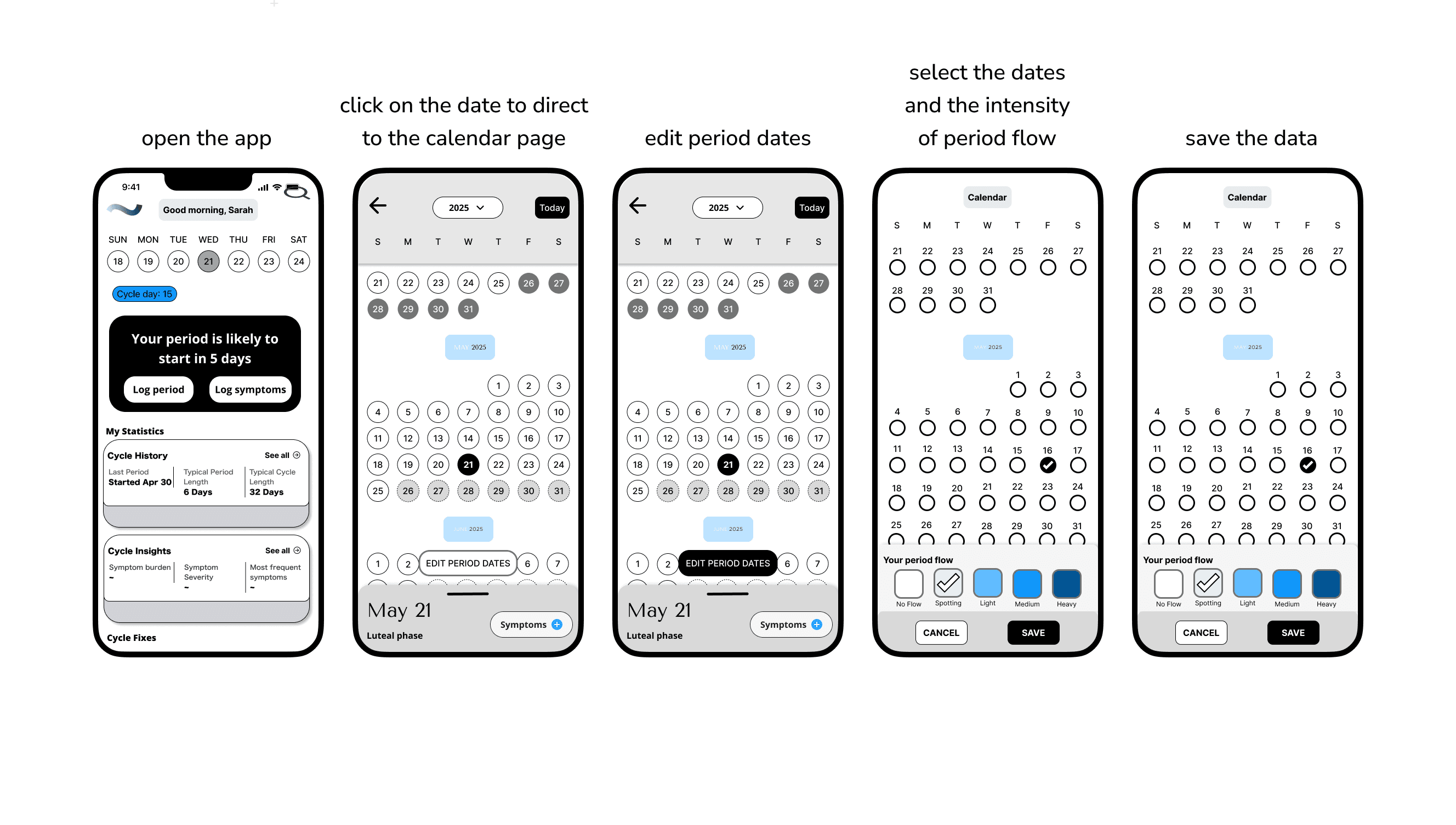
The UI now supports the period‑editing task with explicit flows, with labeled states, and tappable affordances that reduce ambiguity and cognitive load.
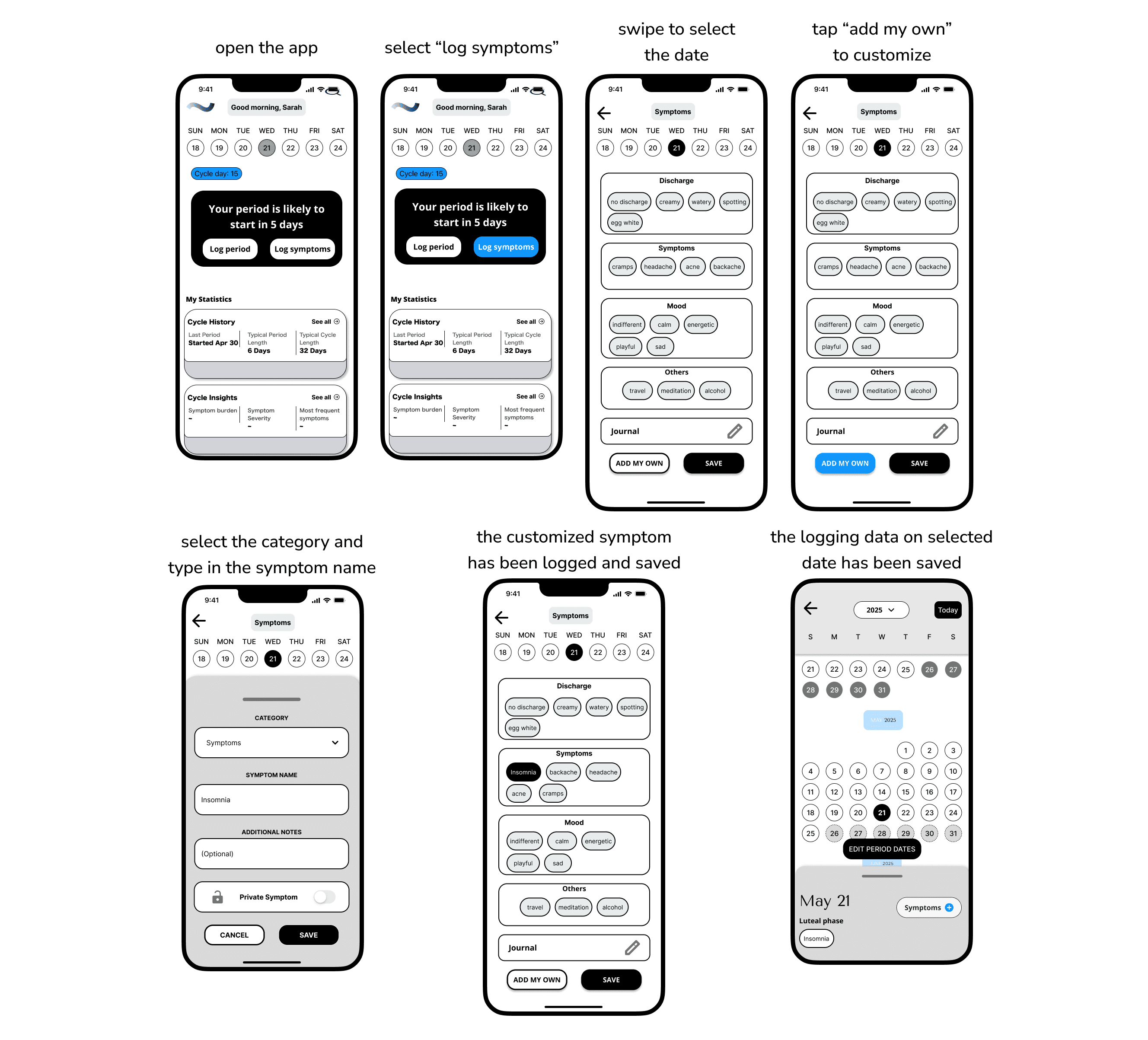
For the symptom logging flow, the mid-fi one now feels more customizable, and confirmable than the low‑fi, with guided entry points and editable bubbles. Explicit save states that reduce ambiguity and increase confidence logging sensitive data.
It also aligns with a supportive tone and daily check‑ins by making customization first‑class without overwhelming the base categories.
🌺 Final Designs & outcomes
Before & After
Before the redesign, there was a lack of focus on what the next steps are for end users.
Through stakeholder feedback and implementation testing, the redesigned system:
reduced cognitive load
🧠 lesson Learned
✅ What went well:
Design thinking has to stay in the why behind the whole system. Designers have privilege. Don't stack beautiful features on a screen. Design for real people behind it, not for function.
🤯 What could be improved:
Skip systems thinking and the dashboard becomes a feature collection, not a workflow